Landing Page Optimization for Small Businesses: Turn Visitors into Enquiries
Getting website visitors is only the first step. Learn how to improve your landing page with clearer messaging, stronger trust signals, simpler forms and better mobile usability to encourage more relevant business enquiries.
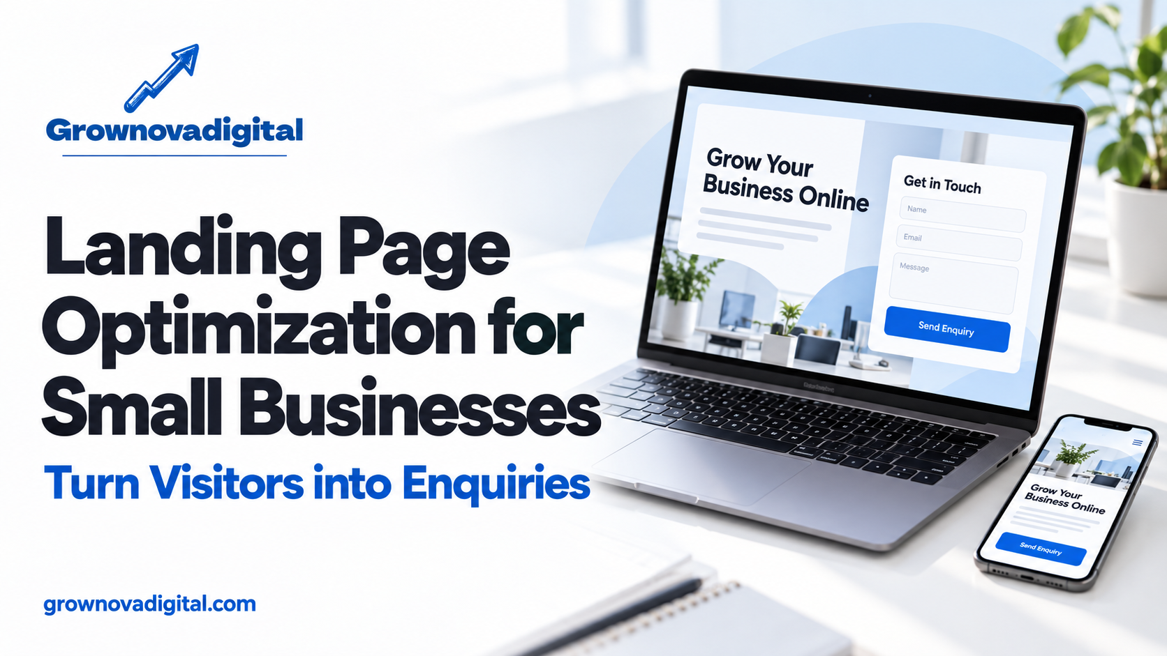
You are getting website visitors. People click your Google Ads, discover your business through search or visit your website from social media. But the enquiry form stays quiet.
Before increasing your marketing budget, look closely at the page those visitors reach.
Does it explain your service clearly? Does it answer their questions? Can they contact you easily from a mobile phone?
Landing page optimization improves these parts of the customer experience. It helps visitors understand your offer, assess whether your business suits their needs and take the next step.
For small businesses, a focused, useful page can be a better starting point than adding more traffic to a confusing website.
What Is Landing Page Optimization?
A landing page is the page someone reaches after clicking a link, search result or advertisement.
Landing page optimization means improving its content, layout and functionality to support a specific action. That action might be requesting a quotation, booking a consultation, making a purchase or contacting your team.
The aim is to make the decision easier for a relevant visitor.
A service enquiry page, for example, should clearly explain:
- What service you provide.
- Who the service is suitable for.
- What the customer can expect.
- Why they should consider your business.
- How to request more information.
1. Match the Page to the Visitor’s Search
Imagine someone searches for “commercial interior designers in Bangalore” and clicks an advertisement about office interiors.
If they land on a general homepage covering residential design, furniture, renovations and unrelated services, they may struggle to find the information they expected.
A dedicated commercial interiors page creates a clearer experience.
Its headline, examples, service details and enquiry form should reflect the visitor’s original interest.
Google’s landing page guidance also emphasizes matching the destination page to the advertisement and keywords, alongside clear navigation and mobile usability.
Practical action: Review your main advertisements and their destination pages. Check whether each page delivers the service or offer promised before the click.
2. Write a Headline That Explains Your Offer
Your opening headline should help a visitor understand your business quickly.
A statement such as “We Create Extraordinary Experiences” may sound impressive, but it does not explain what you actually offer.
A clearer alternative could be:
“Commercial Interior Design in Bangalore for Offices and Retail Spaces.”
Follow it with a short description that explains your approach and the next step.
For example:
“Plan your space with practical layouts, clear project estimates and a consultation tailored to your requirements.”
Use language your customers understand. Specific information is more useful than a collection of broad claims.
3. Give the Page One Main Conversion Goal
A landing page becomes confusing when it gives equal attention to several competing actions.
Visitors may see buttons to download a brochure, read a blog, subscribe to a newsletter, explore every service and contact the sales team.
Choose one main goal for the page.
For a service business, useful options include:
- Request a quotation.
- Book a consultation.
- Schedule a site visit.
- Discuss your requirements.
You can still provide supporting information and navigation. Keep the main action visually consistent so visitors can recognize it throughout the page.
4. Explain Benefits With Concrete Details
“High quality” and “customer satisfaction” are common claims. Visitors need information that helps them judge whether your service meets their requirements.
Connect each service feature to its practical value.
For example:
A clear project scope:
Helps customers understand what the quotation includes.
A dedicated contact person:
Gives customers a straightforward way to ask questions.
Service coverage information:
Helps visitors confirm whether you operate in their location.
A defined delivery process:
Explains what happens after the enquiry.
Include only benefits your business can actually deliver. Avoid unsupported promises about guaranteed sales, rankings or results.
5. Add Trust Signals That Customers Can Verify
A visitor may understand your service but still need reassurance before sharing their contact details.
Useful trust signals include genuine customer reviews, relevant project examples, team information and clearly explained processes.
A case study should describe the customer’s problem, the work completed and the outcome you can substantiate.
For a new business without many reviews, start with real information: who runs the business, what experience the team has and how customers can reach you.
Use client logos, testimonials and project images only when you have permission to publish them.
6. Keep Enquiry Forms Simple but Useful
A long form can make the first enquiry feel like an application process.
Start with the information your team needs to respond effectively. Depending on your service, that may include:
- Name.
- Phone number or email address.
- Required service.
- A short message.
Add qualification questions when they serve a clear purpose. For example, project location or a budget range may help your team assess whether an enquiry is suitable.
Make required fields obvious. Show useful error messages and explain what happens after submission.
Most importantly, test the complete process. Confirm that enquiries reach the correct inbox or customer management system.
7. Check the Entire Experience on Mobile
A page that looks polished on a desktop may be difficult to use on a phone.
Open your landing page on a real mobile device and try to submit an enquiry.
Check whether:
- Text is readable without zooming.
- Buttons are easy to tap.
- Forms fit the screen.
- Pop-ups cover important information.
- Phone and WhatsApp links work.
- Images load without disrupting the layout.
- The confirmation message appears correctly.
A clean white background, readable typography and restrained colours can support a professional appearance. The design should make the information easy to follow.
8. Answer Questions Before Visitors Have to Ask
Customers often hesitate because important details are missing.
Depending on your business, they may want to know:
- Do you serve my location?
- What does the service include?
- How do you prepare a quotation?
- What information do you need from me?
- What happens after I enquire?
Answer these questions close to the relevant service information or contact section.
If pricing depends on the project, explain the factors involved. A transparent explanation is more helpful than asking every visitor to contact you for even basic details.
9. Measure Meaningful Enquiries
Page views alone do not show whether a landing page is helping your business.
Track completed enquiry forms, bookings and other relevant actions. Review those alongside the quality of the enquiries your team receives.
Keep different actions separate. A WhatsApp button click shows that someone opened a contact route; it does not confirm that they sent a message or became a qualified lead.
Two useful calculations are:
Enquiry conversion rate = completed enquiries ÷ relevant visits × 100
Cost per qualified lead = advertising spend ÷ qualified leads
Agree on what counts as a qualified lead before comparing performance.
10. Improve One Important Element at a Time
Changing the headline, offer, form, images and audience together makes it difficult to understand what influenced the outcome.
Begin with a specific problem.
If visitors misunderstand your service, improve the opening message. If people struggle to submit the form, fix the form experience. If enquiries are irrelevant, examine both the traffic source and the page’s qualification information.
Where traffic allows, compare a focused change through a controlled test. With smaller traffic volumes, combine performance data with customer feedback and direct usability checks.
Avoid declaring a change successful after only a handful of visits.
Frequently Asked Questions
Should I send every advertisement to my homepage?
Choose the page that best matches the advertisement. A homepage may work for a broad brand campaign, while a specific service campaign often needs a page focused on that service.
Will a landing page redesign guarantee more leads?
No. Results also depend on the audience, offer, traffic quality, competition and follow-up process. Improving the page addresses one important part of that wider system.
Should I remove all navigation?
There is no universal rule. Keep the main action clear while allowing visitors to find information they need to make a decision.
What should I improve first?
Start with relevance, clarity and functionality. Confirm that visitors reach the right page, understand the offer and can complete the enquiry process.
Build a Clearer Path From Visits to Enquiries
Before spending more on traffic, make sure your website gives potential customers a clear reason to contact you.
Relevant messaging, useful service details, credible evidence and a working enquiry process provide a stronger foundation for your marketing.
GrowNovaDigital helps businesses connect SEO, advertising and website development with their lead generation goals.
Want to discuss your website and enquiry process? Book a free consultation.
WhatsApp: +91 82205 95277 Website: https://grownovadigital.com/